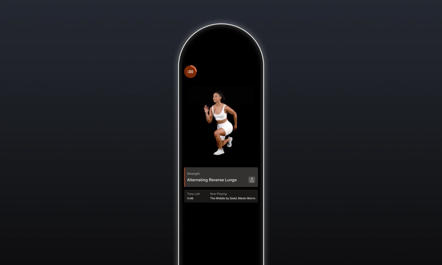
Alter Screen
Enhancing strength workouts for seamless focus and motivation.
Lead Designer
2 weeks
Rapptr Labs
Smart Mirror
Overview
Alter is a comprehensive fitness system that provides hyper-personalized workouts based on your DNA and biometrics. With the Alter Screen, you can work out at home with top industry trainers and receive real-time feedback on your form. Powered by AI, the Alter Screen transforms strength workouts into safe and motivating experiences. However, user feedback revealed some issues. Lengthy rest periods, unconventional naming, and a cluttered interface left users feeling frustrated about the quality of their workouts. To address these concerns, Alter partnered with Rapptr Labs in 2023 to create a seamless strength training experience, helping users feel motivated to achieve optimal results.
Approach
As the lead designer, I worked closely with the product and engineering teams to deliver new designs within a challenging two-week timeframe. In response to increasing negative feedback from beta users, we adopted an agile approach, focusing on the most urgent issues for the upcoming release.
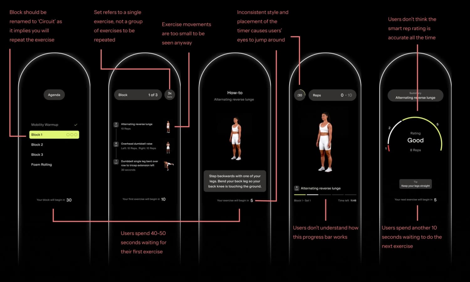
Step 1: Match Users' Mental Model
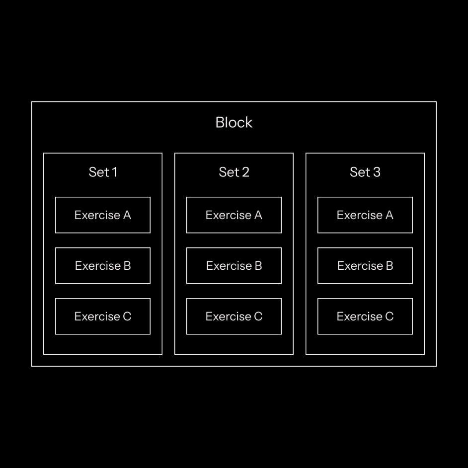
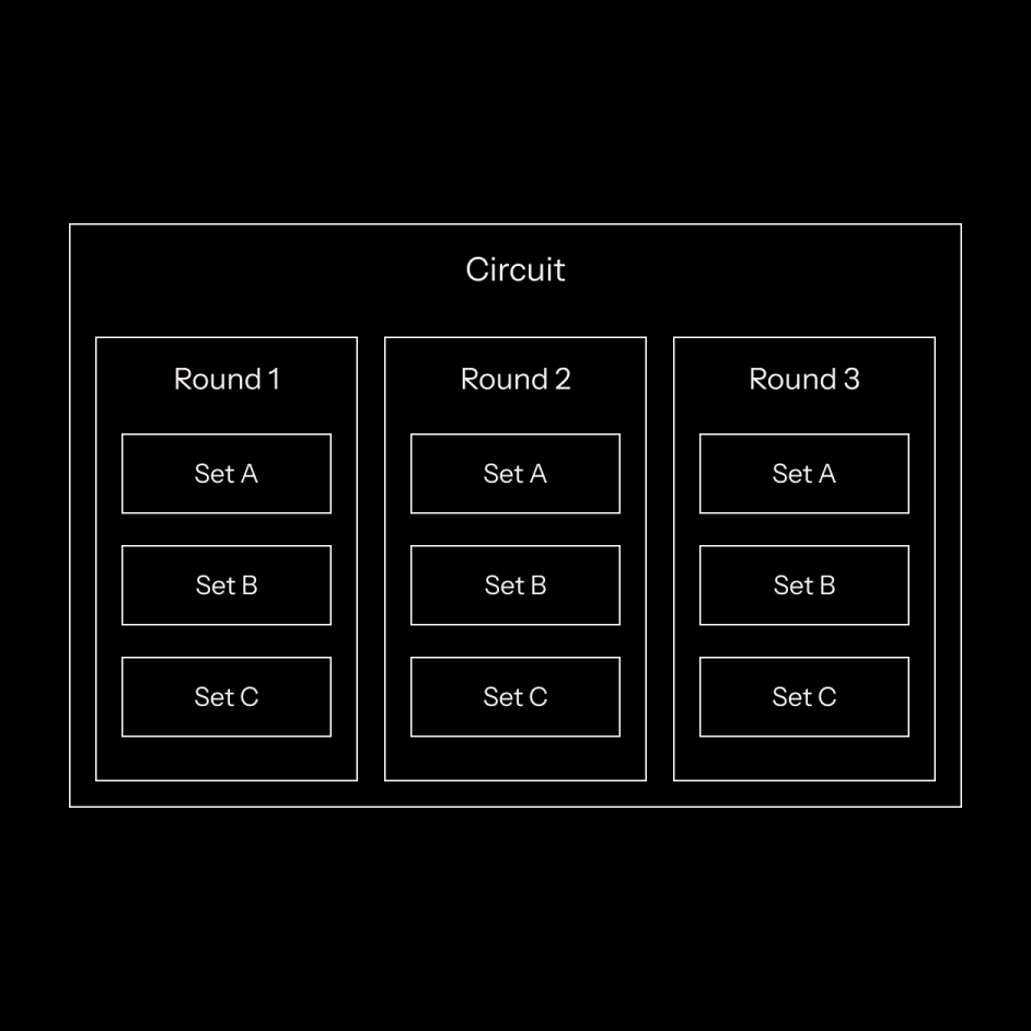
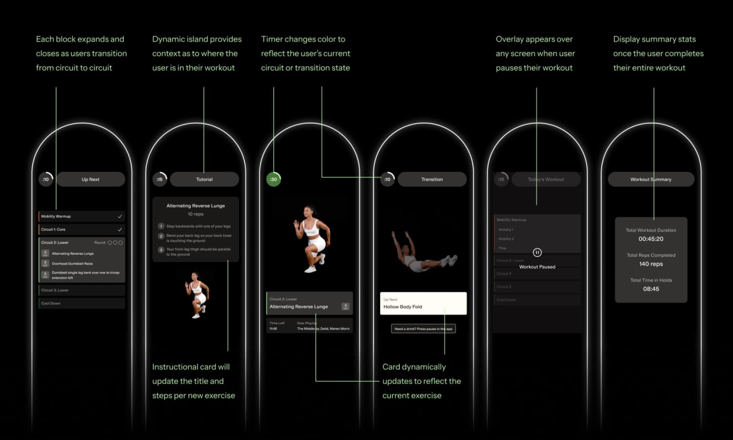
A significant problem with the original design was the confusing structure of the strength workouts. Each workout was divided into three ‘blocks,’ a term not commonly used in the fitness world. Users had to complete each block for three ‘sets,’ a phrase usually referring to repetitions for a single exercise but was incorrectly used here to describe a group of exercises performed together. To align with users’ mental model of a typical workout, I revised the agenda using standard exercise terminology. I replaced ‘block’ with ‘circuit,’ a familiar term representing a group of exercises. I also used ‘round’ to indicate the number of times a circuit should be completed and ‘set’ to denote the number of repetitions for a single exercise. Using standard terminology made it clearer for users to understand where they are in the workout.
Step 2: Improve the Timing
Another significant issue was the excessive number of individual screens and the time spent on each. For each round, users were shown a series of screens, including the workout agenda, circuit structure, and tutorial, for a total of 40-50 seconds before their first set. After each set, they spent another 10 seconds evaluating the Screen’s feedback on their form while waiting for the next set to begin. This large downtime caused users to lose momentum and become demotivated over time. To create a seamless workout structure, I consolidated the screens and used animations to showcase the user’s progress as they transition between different rounds and circuits. Collaboration with engineering was necessary to test the timing between various states in order to give users just enough time to rest and prepare for the next set.
Step 3: Clean Up the Clutter
Our final challenge was to introduce uniformity and consistency to an interface that previously lacked both. For instance, the timer had inconsistent placement and visual style across screens. Additionally, excessive text on the screen posed a significant issue for users with low vision, as they often stood 4-5 feet away from the display. To solve these issues, I designed modular components that could be reused across various states. For example, the 'dynamic island' and timer elements were consistently positioned at the top of every screen state, providing users with clear information about their current workout status and remaining time. I also used color coding to help users easily identify the circuit they were in; UI elements appeared green during strength circuits and blue during cool downs. By being intentional with reusable components and color, strength workouts became more motivating for users to complete.
Design Opportunities
During the redesign, I aimed to address additional challenges. First, the absence of clear UI documentation often forced the engineering team to improvise, leading to a static and unengaging workout experience. Second, I found that the experience was missing an important feature often found in fitness apps—user achievements. In order for users to stay motivated, it’s important to recognize and celebrate their milestones.
Adding organization and consistency
To streamline engineering workflows, I started to build the foundation for a design system. I first created a comprehensive color sheet complete with hex values to ensure consistent usage across the designs. I applied the same approach to document and standardize text styles. Lastly, I built a reusable component library using atomic design principles to clearly document various states and properties for engineering to reference.

Celebrating User Achievements
To celebrate the user’s milestones, I started to explore different variations for the workout summary screen. The goal was to end the workout on a high note by showing key metrics that would boost the user’s confidence. Given the additional engineering resources required, we decided to include these designs in an enhancement update after the engineering team addressed the most critical issues.
Feature Work
The collaborative efforts between design, product, and engineering teams led to a workout experience that not only challenges users to build up their strength, but consistently keeps them motivated to achieve their fitness goal.
Impact
Post launch, the team received positive feedback from beta users about the clean interface and enhanced user experience. Moreover, these results combined with the strong relationship I established with the Alter team resulted in securing a full-time contract for Rapptr to provide ongoing design services.
This is a huge improvement. I felt challenged in a good way, and I appreciate that the rest periods were shortened. I did not like having to wait around in the last version.
Kyle D.
The new colors were a nice touch. I have a better sense of where I am in the workout, and I like that the timer changes colors each time I’m in a new circuit or transition.
Yanelly S.
It just feels like a smoother experience. The timing between the agenda, tutorials, rest periods, and workouts flowed better. I felt a lot more engaged.
Katie M.
I like the little animations as you transition from circuit to circuit. I’d love to see more of that in future versions. It makes the experience feel more unique.
Penelope K.
I love how clean the UI feels. It was cluttered before, and I spent more time reading information than working out. Now it’s the complete opposite and it’s much more fun.
Justine R.
I appreciate the removal of the rep rating actually. It felt demotivating to see negative feedback after every set. I’m more focused on completing the entire workout now.
June N.