Alter App
Improving how users complete their fitness plan while discovering new content on the app.
Lead UI Design
3 weeks
Rapptr Labs
iOS, Android
Overview
Alter is a fitness and wellness startup with a mission to provide hyper-personalized fitness programs and coaching tailored to your unique DNA and biometrics. Through their app, users receive customized workout and recovery plans designed to help them reach their fitness goals. By completing their personalized plans, users can earn credits that can be applied to waive their monthly subscription fees. After the initial launch in January 2024, Alter received feedback that the cluttered interface made it difficult for users to understand how to complete their weekly fitness plan. They also struggled to find specific workouts and work-ins within the app. With this problem in mind, Alter engaged with Rapptr Labs to improve how users complete their plan while discovering new content on the Alter app.
Approach
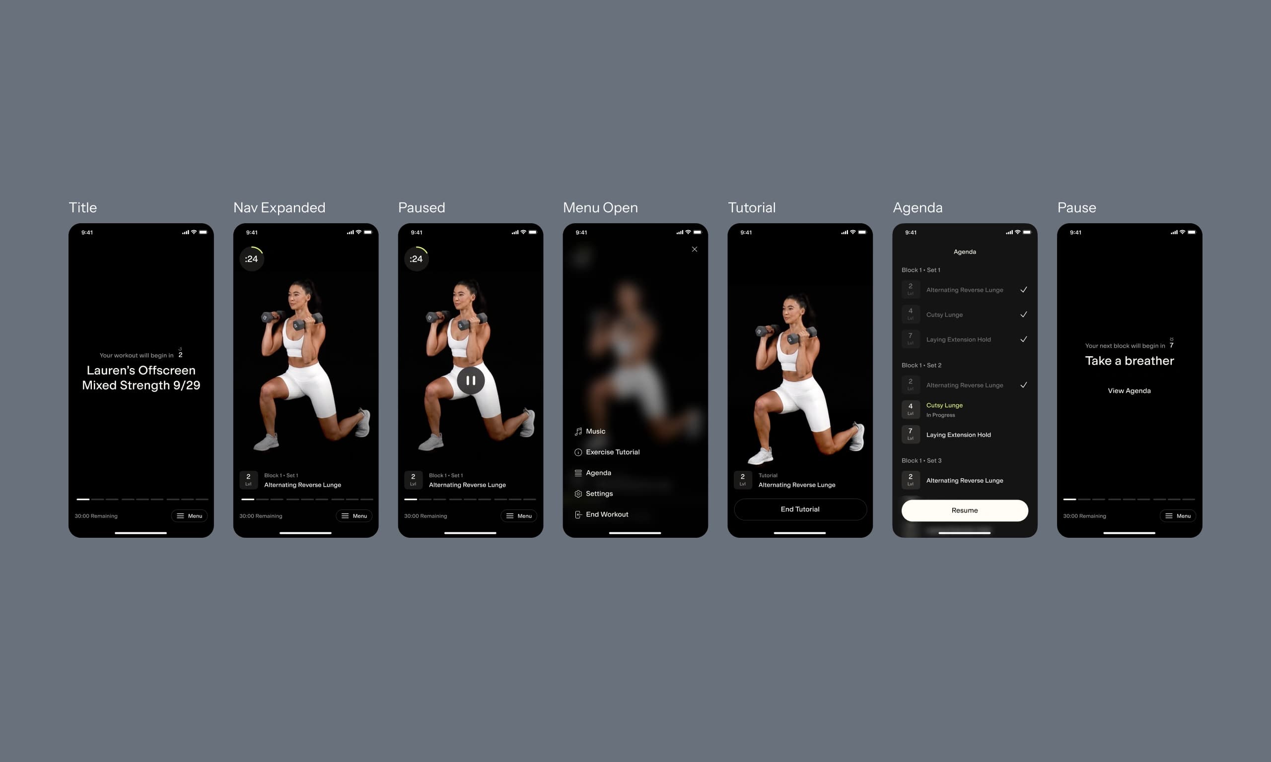
We collaborated closely with Alter's internal design team to complete the handoff within a three-week timeframe. Given the time constraints, we decided to focus on the Today Tab and Plan Tab. While their team led the restructuring of the app's information architecture, I spearheaded the redesign and prototyping of the visual UI to make it more lively, dynamic, and motivating for users to complete their plan.
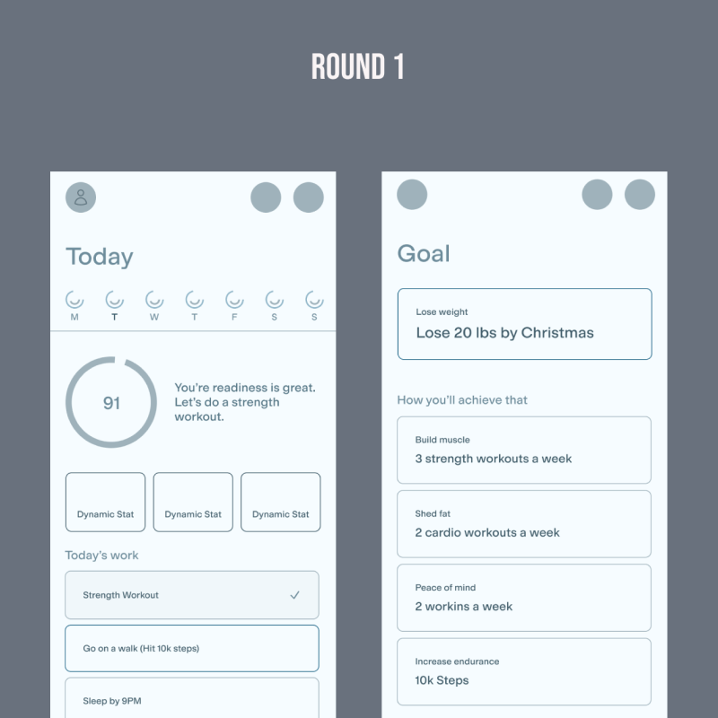
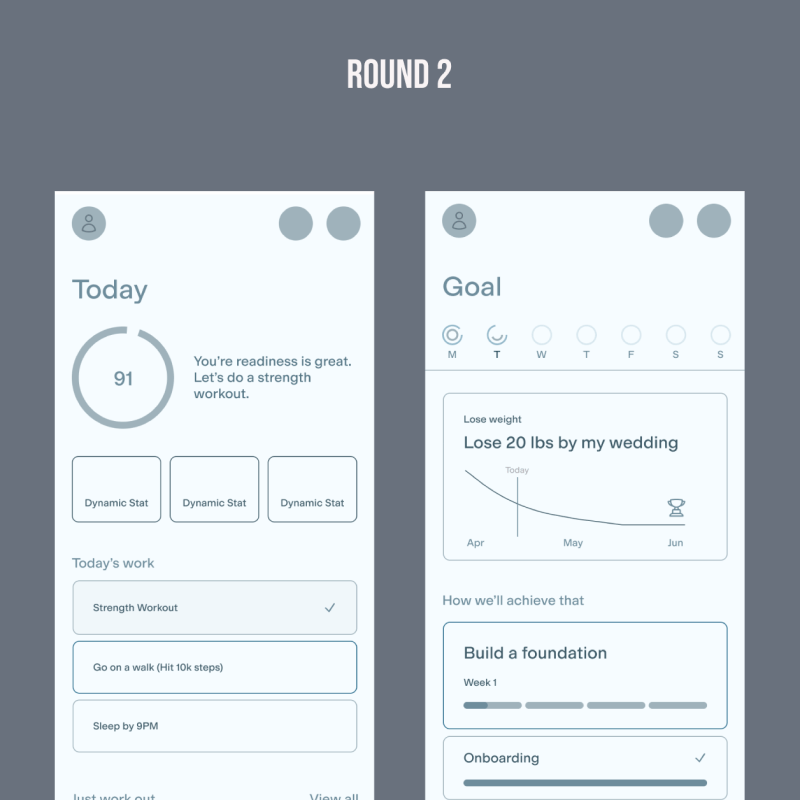
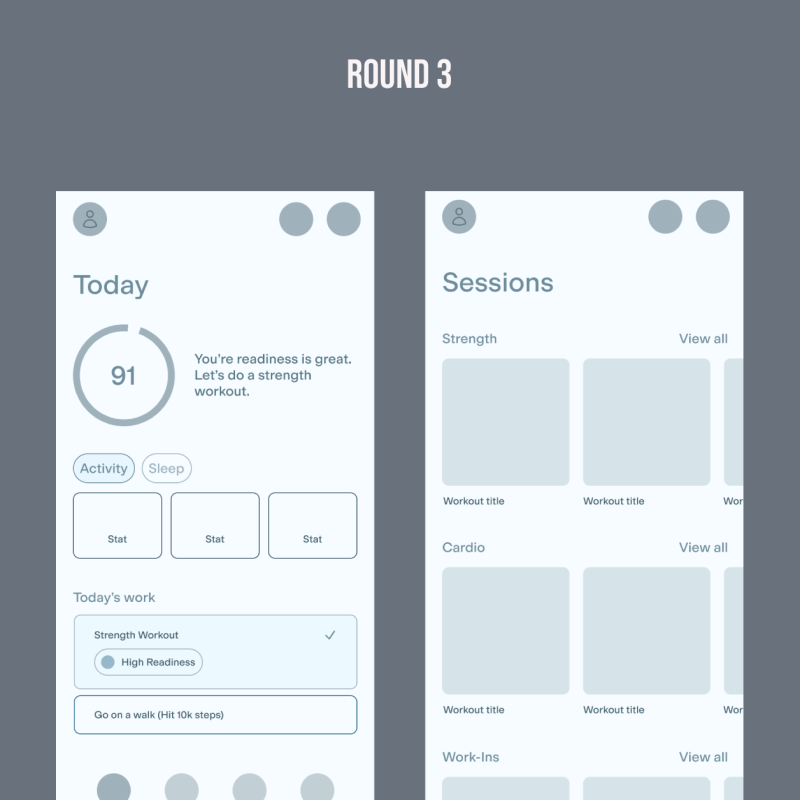
Restructuring the Information Architecture
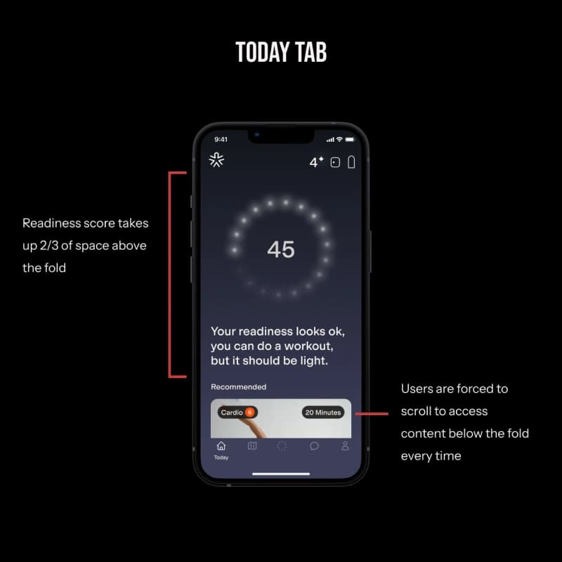
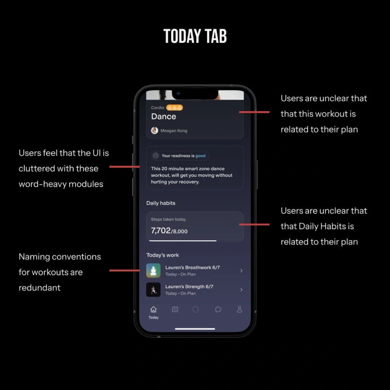
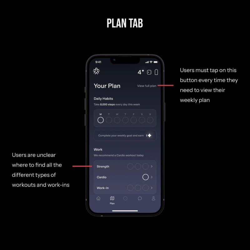
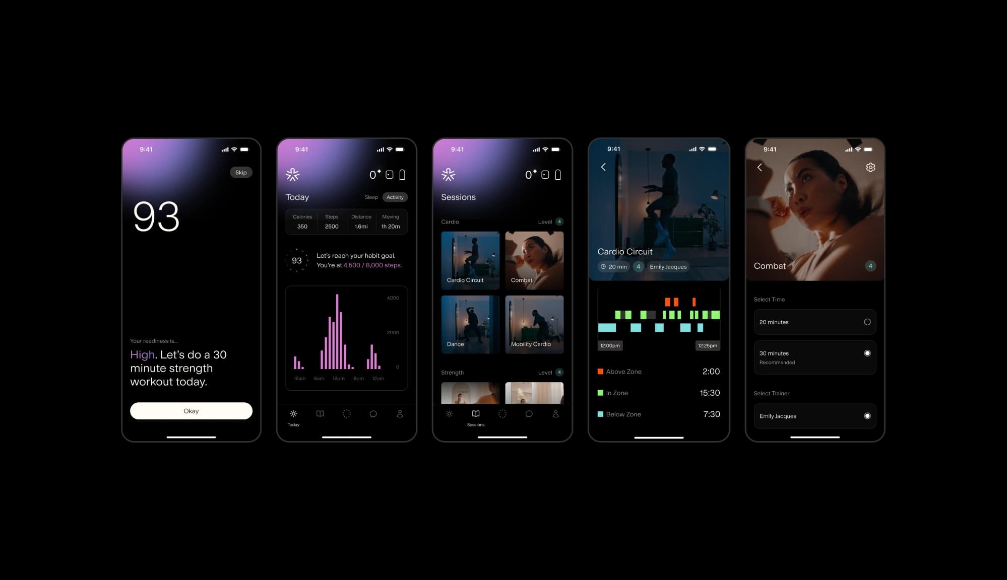
As a team, we evaluated the original design's intent and shortcomings. The Plan Tab should give users a bird's-eye view of their weekly workout and habit goals, while the Today Tab should provide specific daily tasks. However, the separation of these tabs made it difficult for users to understand how to complete their plan. The prominent hierarchy of the plan also pushed the workout library into sub-screens, making it difficult for users to easily start a workout. With this in mind, we consulted the Performance Council, product team, and sales team to understand users' mental model of the plan, their training preferences, and the workouts they were most interested in. These insights led us to rethink the app's complex gamification of the plan. So we moved towards a simpler approach: complete 20 workouts per month to waive your subscription fee.
Diving into the Visuals
I took the lead on exploring visual UI treatments and saw three areas of opportunities for us to bring more excitement to the app through color, animation, and assets.
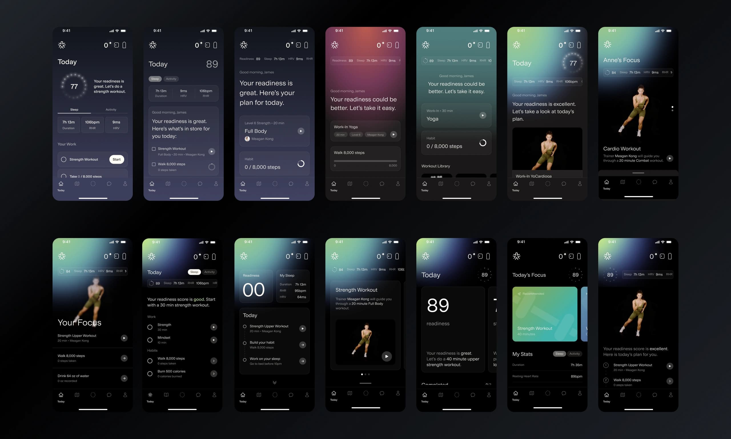
Color
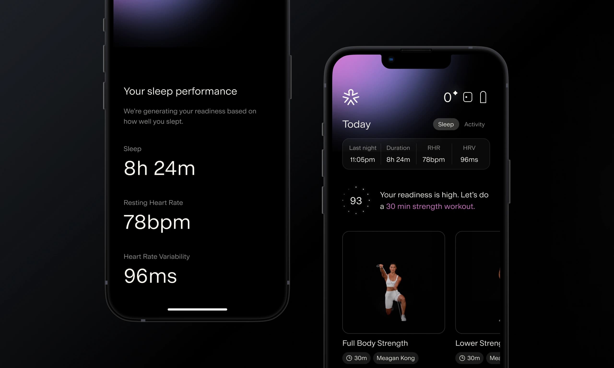
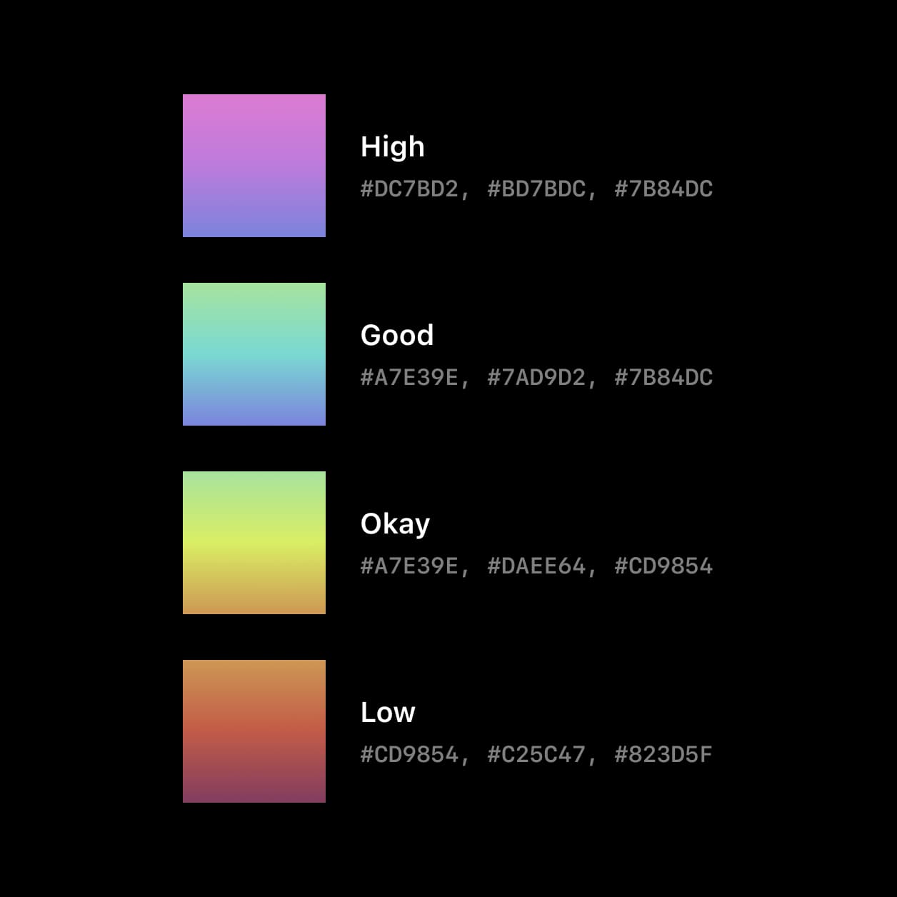
I first analyzed other fitness apps to see how they use color, noting that they often use one brand color for primary actions and 3-4 additional colors for data visualizations. However, for the Alter app, I wanted to use color to build an association with the user’s readiness score — a number between 1 and 100 that indicates how prepared their body is for exercise and what drives their recommendation. The score falls into one of four categories: High, Good, Okay, or Low Readiness. As a result, I created four distinct color gradients and designed a dynamic color change feature, allowing users to be constantly aware of their body's readiness.
Animation
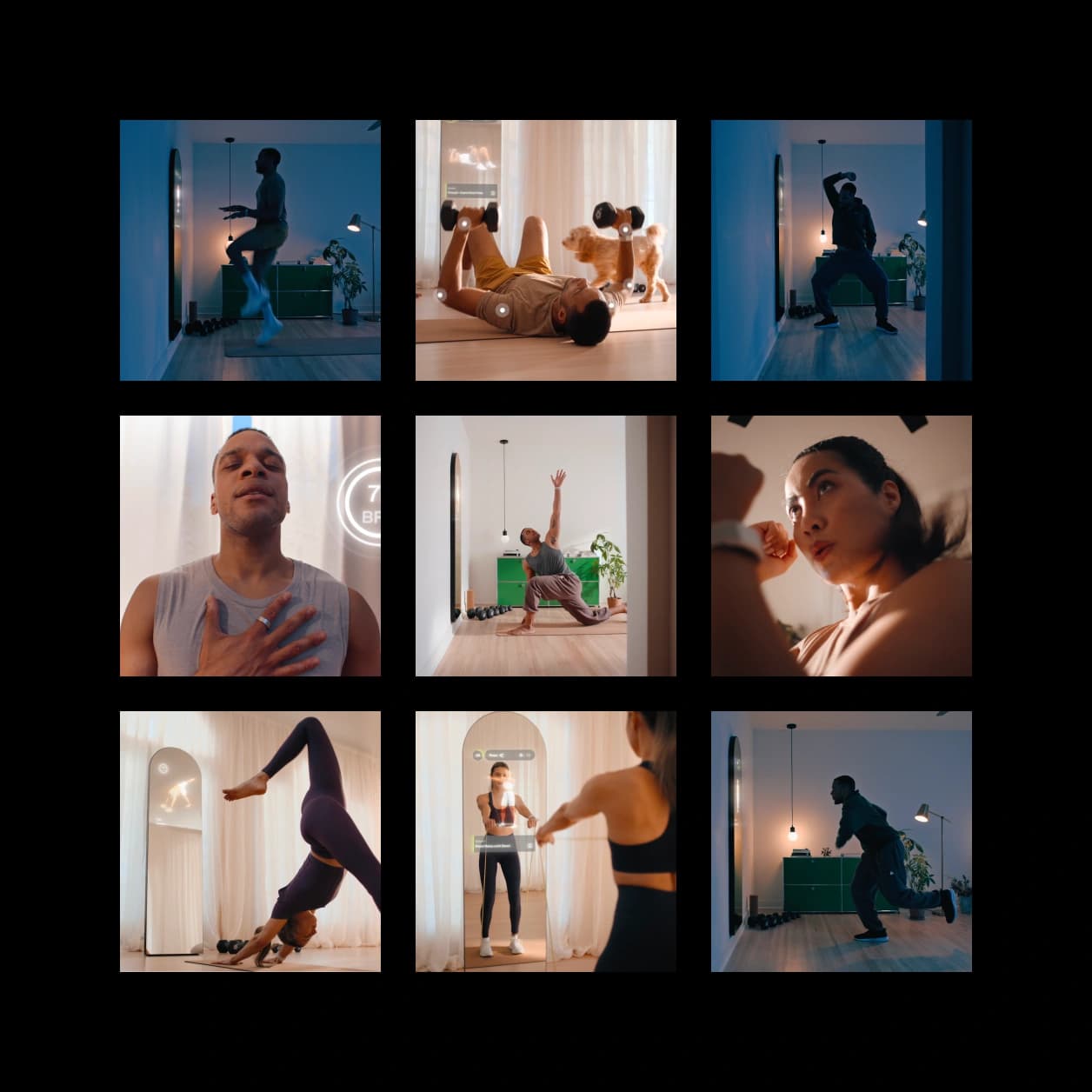
The static nature of the app led me to identify specific flows where animations could be added to excite and motivate users. One key opportunity was the morning sync—a daily event where the app syncs biometric data from the user’s wearable device to provide a readiness score. To create a "smart" feel and build suspense, I collaborated with the engineering team to animate the sleep data and readiness score as they count up. Additionally, I added subtle movement to the readiness gradient blob to make the app feel more dynamic as users navigate through it.
Assets
Working with our marketing team, I assessed our existing assets and saw an opportunity to incorporate lifestyle photos, helping users to visualize themselves using the product in action. I also aimed to include images of the trainers, allowing users to build familiarity and a connection with them.
Establishing Best Design Practices
During the visual redesign phase, I also implemented workflow changes to improve collaboration between the design, engineering, and product teams. For months, these teams had expressed various pain points. For instance, having multiple design files made it difficult for team members to find specific designs and assets. Moreover, the lack of a reusable component library led to inefficiencies and an inconsistent look and feel across the app.
Improving Team Organization
I collaborated with Alter's design and engineering teams to create a streamlined file management system. I established a single handoff file for engineers to reference finalized, annotated designs. Additionally, I created a separate file for the design team to explore and refine mockups.
Promoting Consistency
Working closely with engineering, I established a design system by creating a reusable component library and using variables to ensure consistent use of color and typography. This ultimately sped up the development process and made it easier for design to make changes across the entire file.
Empowering Engineers
I advocated for our team to use Dev Mode by Figma, including marking designs as “Ready for Dev” and providing additional context through annotations. This made it easy for developers to view crucial callouts during handoff.
Feature Work
The collaborative efforts between design, product, engineering, marketing, sales, and performance teams resulted in a beautiful transformation of the Today and Plan tabs.
Impact
Post launch, our product team monitored specific metrics and gathered feedback to assess the impact of the redesign on our core user base.
+18%
+15%
+12%
The latest update is a game changer. The new colors and animations make me excited to see how well I slept last night. It’s a great way to start my day.
Alexis X.
The animations make it feel lively, and the new interface is clean, modern, and so much easier to navigate. Great job to the team for making these thoughtful changes!
June N.
Having a dedicated workout library is what I’ve been needing for awhile. It's super easy to find what I'm looking for, and the new layout makes everything more intuitive.
Penelope K.